

The free interactive tool brings together measured broadband performance, reported network coverage, provider observations and five years of local change. Enter a postcode area, town or city and it builds a detailed picture of broadband in that location, from the speeds measured in real homes to the providers credibly observed there.
It is intended for anyone who wants to look beyond the national averages. That includes households curious about their area, journalists investigating a local story, students and academics conducting research, and organisations trying to understand the broadband landscape around the places in which they operate.
“National broadband figures are useful, but nobody lives in a national average,” said Fibredog founder, Editor-in-Chief and consumer telecoms analyst Dan Howdle. “People live in Bournemouth, Birmingham, a village in Cumbria or one particular part of London. We wanted to build something that lets you examine broadband at that level, without pretending one headline number can tell the whole story.”
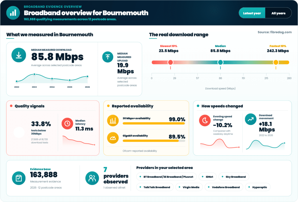
The overview is just one part of the tool. It also features an interactive map and several differing ways to visualise and understand the data.
What does the UK Broadband Data Explorer show?
The Explorer is made up of six connected views, each looking at the selected area from a different angle. The broadband overview summarises the most important findings, including measured download and upload speeds, latency, the spread between slower and faster results, reported availability and the providers observed locally.
The interactive map shows how measured performance varies across the selected postcode areas. The speed-distribution view looks beyond a simple average to show the slower 10%, the median and the fastest 10% of qualifying tests. A separate comparison examines the gap between the broadband speeds reported as available and the speeds people appear to be receiving in practice.
There is also a provider landscape showing which broadband companies were credibly observed, how widely they appeared across the selected area and how their measured results compare. Finally, the five-year time machine shows how local broadband has changed across equivalent annual periods.
The results can be switched between the latest year and all available years. Global filters allow users to refine the years, postcode areas and providers included throughout the Explorer, while Fibredog’s Chaos Filter removes evidence that does not meet the tool’s geographic, statistical and consistency requirements. Why not give it a try?